Helping taxpayers when they’re due a refund
I helped HMRC to better serve the taxpayer by designing a service to track VAT repayments online.
The problem
When a VAT repayment is delayed, it can spell disaster for business as predicting cash flow is vital. Understandably, people want to know when they’ll get paid.
In 2018, HMRC had no online service to allow people to track their repayments. 50,000 people called the VAT helpline asking “where’s my money?”. To further complicate things, if a user hadn’t supplied bank details, HMRC had to send a cheque. Combined, telephone support and cheques cost HMRC around £1M a year. The business objective, naturally, was to reduce these costs.
Discovery
In the discovery phase, we:
- interviewed users to find out how they track repayments;
- chatted with HMRC staff to understand the end-to-end repayments process;
- ran workshops to identify the problems and places for improvement.

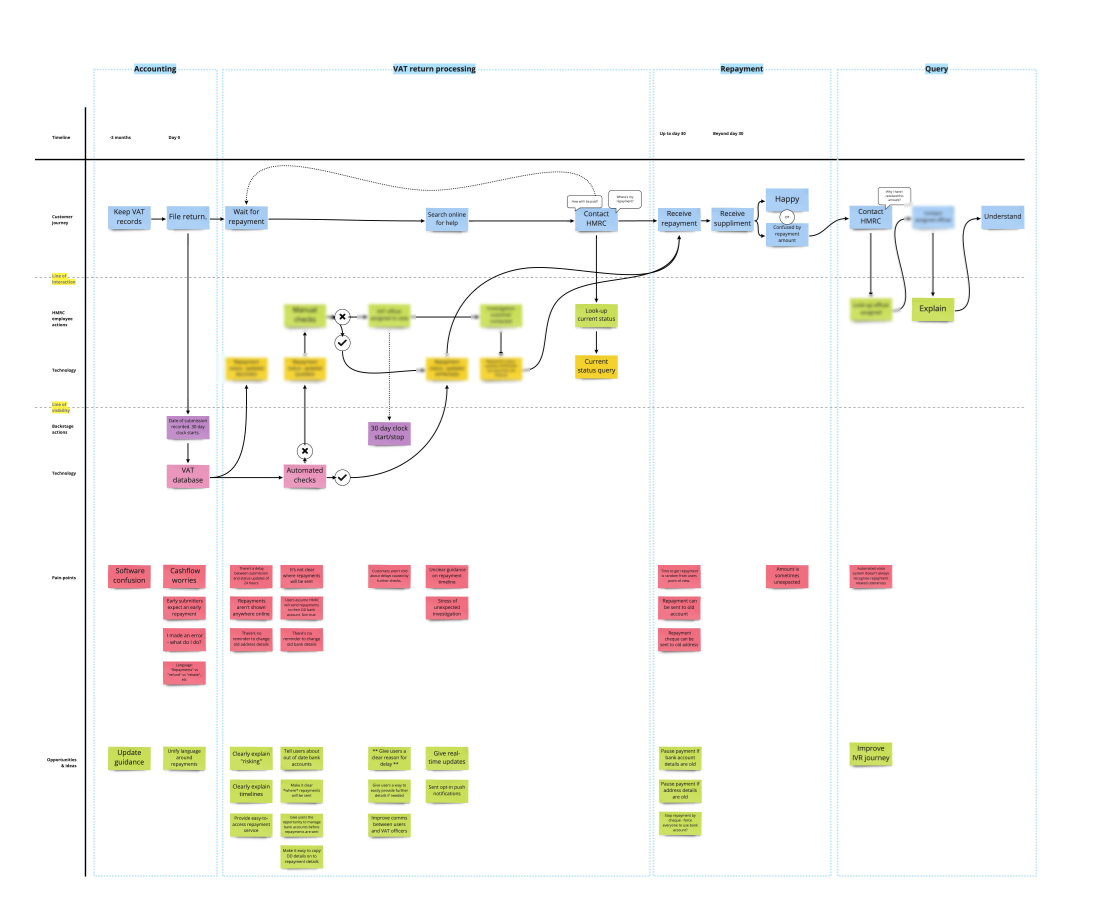
When a company submits a VAT return, it triggers a complex set of interactions between the user, employees and software. To understand this journey, we set about creating a service map.
This was a significant challenge; VAT is complex, involving many people and processes. There isn’t just one VAT team, so we spent a lot of our time trying to find out who could answer our questions.
For example, understanding why a repayment might be delayed was particularly tricky. The vetting process for repayments is a closely guarded secret. It’s done on a case-by-case basis, and fraud can be a problem. Naturally, HMRC didn’t want to give away anything that might make it easier to cheat the system.
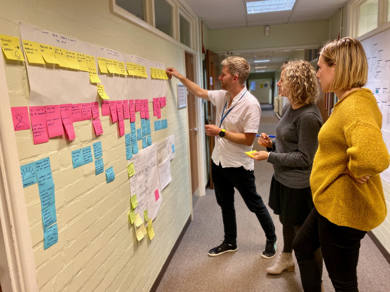
Mapping the service took weeks. At our daily stand-ups, we slowly filled in the process on our “wall of knowledge”.
Getting to know our users
Speaking with users, we found that for the majority, the repayments service was working well. But for around 15% of people who did have a problem, this often resulted in confusion and multiple calls. These were the users for whom we needed to improve the service.
Even those having a good experience were confused about how they’d be paid. For example, users thought that setting up a Direct Debit meant that repayments would be sent back to the same account. This isn’t true, people have to provide a “repayment account”. Without one, HMRC would send a cheque.
Our user researcher, Kathy, identified some user needs:
- tell users how they’d get their repayment;
- notify users when they’d get their repayment;
- tell users about any delay and inform them how to fix it;
- tell users if HMRC had used repayments to offset other debt;
- notify users when HMRC had sent repayment.
Pain points and opportunities
A service blueprint allowed us to identify pain points and opportunities by comparing the blueprint against the user needs. We were then able to rapidly spot areas for improvement.

Alpha
In the Alpha phase, we:
- “went wide” by generating as many ideas as possible;
- got buy-in from the business for our general approach;
- worked with other teams to improve the parts of the process we didn’t have direct control over;
- and, built and tested some prototypes
Going wide
We now had a clearer understanding of the existing process and the problems facing our users. It was time to “go wide” to create as many ideas as possible. I usually like to involve as many people in this part as possible. By engaging with a big group who have familiarity with different elements of the service, you often end up with unexpected solutions.

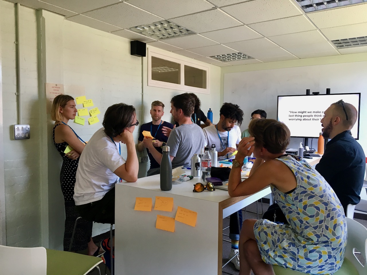
For this project, I ran an ideas workshop with stakeholders from HMRC and other designs from the digital centre. We focused on two, deceptively simple-looking questions:
- How might we make calling HMRC the last thing people think of when worrying about their VAT repayments?
- How might we make a repayment by cheque a thing of the past?
This is always my favourite part of the design process: Working with people who wouldn’t call themselves creative and seeing them come up with ingenious ideas. Having other designers in a workshop is excellent, but involve others who actually work on the thing you’re trying to improve, and you’ve got magic!
Jon is hands-down the best UX designer I’ve worked with. His creativity, technical mindset, and ability to bring people together makes every project fun with guaranteed results. I’d jump at the chance to work with Jon againLouise Maloney, Content designer
Buy-in from the business
In HMRC Digital, we work alongside other parts of the revenue—what we loving refer to as “the business”. There’s naturally a lot of red tape in government, and solutions can be narrowed early. So we needed to get buy-in before we did any serious testing with users. I put together some options in Sketch. The intention was to demonstrate a general direction to the business.
The simple tracker
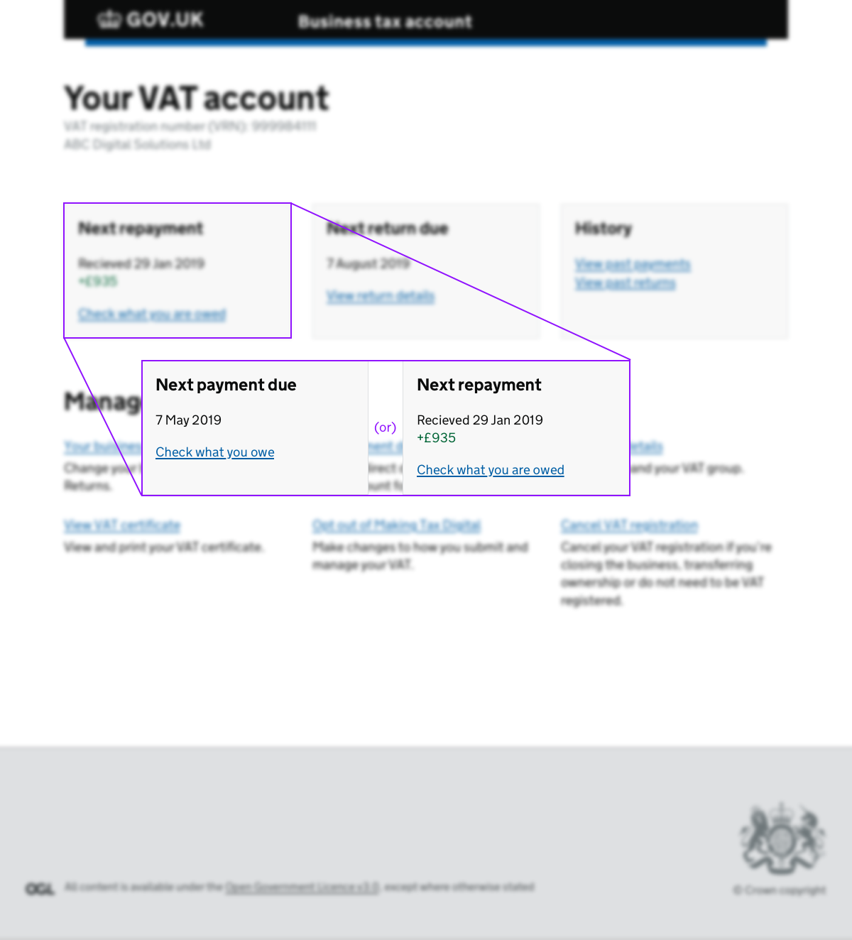
In some ways, this solution would have made a lot of sense. We proposed that we allowed users to track repayments directly as part of their VAT account dashboard.
The integrated tracker was never going to fly as it meant we’d have to hand the work over to another team. When cost centers have more sway than user need all you can do is roll with the punches, but it’s a shame when business structure imposes itself on the UX.

The third-party tracker
Thanks to the Making Tax Digital programme, VAT payers were now submitting tax returns from MTD compatible software. We thought it probable that people would want to see any repayments progress in the same place, too. We thought providing an API would be an ideal addition to any service hosted on GOV.UK. The business agreed but proposed funding the API work as part of a possible second phase.
The “deluxe” tracker
The deluxe tracker was created to show complete information about repayments. By providing a full history of statuses with an explanation of what they meant, we could hit every one of the user needs. Thankfully, the business agreed and green-lit further work on this solution.
When will I get my repayment?
One thing that kept coming up in testing was the question “when will I get my repayment?” We felt that without showing dates, we wouldn’t put a dent in the volume of calls to the helpline.
The problem was that we couldn’t just pull a date out of an API as no such data existed. We did, however, know when the user had submitted their return and how long HMRC allowed for repayments; at 30 days HMRC would have to pay a “repayment supplement” if the delay was their fault. So we tested a version with an approximate date. This worked great!
If repayments were delayed beyond 30 days, we added a new timeline item to the history acknowledging this and providing guidance on what the user could try next.
This also prompted us to redesign the tracker history page. Making the amount and estimate date front-and-centre worked well during testing.