Improving design process at Onalytica
I helped Onalytica’s design and product teams improve processes and kick-start a standardised approach to interface design.
Discovery
Onalytica’s goals were threefold:
- To identify their most pressing usability problems;
- to validate their current discovery and development process;
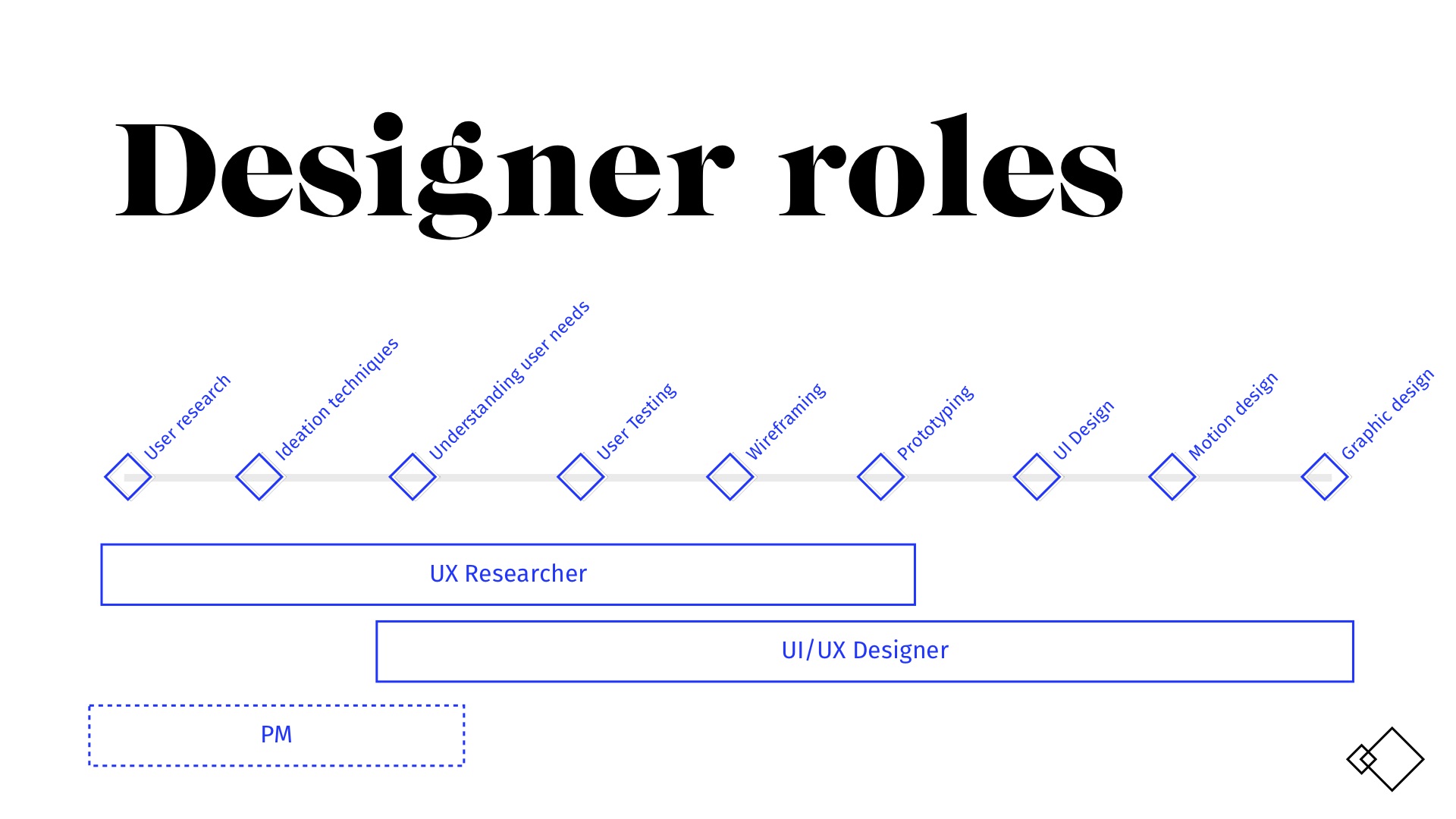
- to help better define roles and responsibilities within the product and design team.
I spent time interviewing their users — both external clients and internal “power” users. I also conducted one-to-one sessions with designers, product managers and developers.
Refining design process
Aligning teams, bottom-up
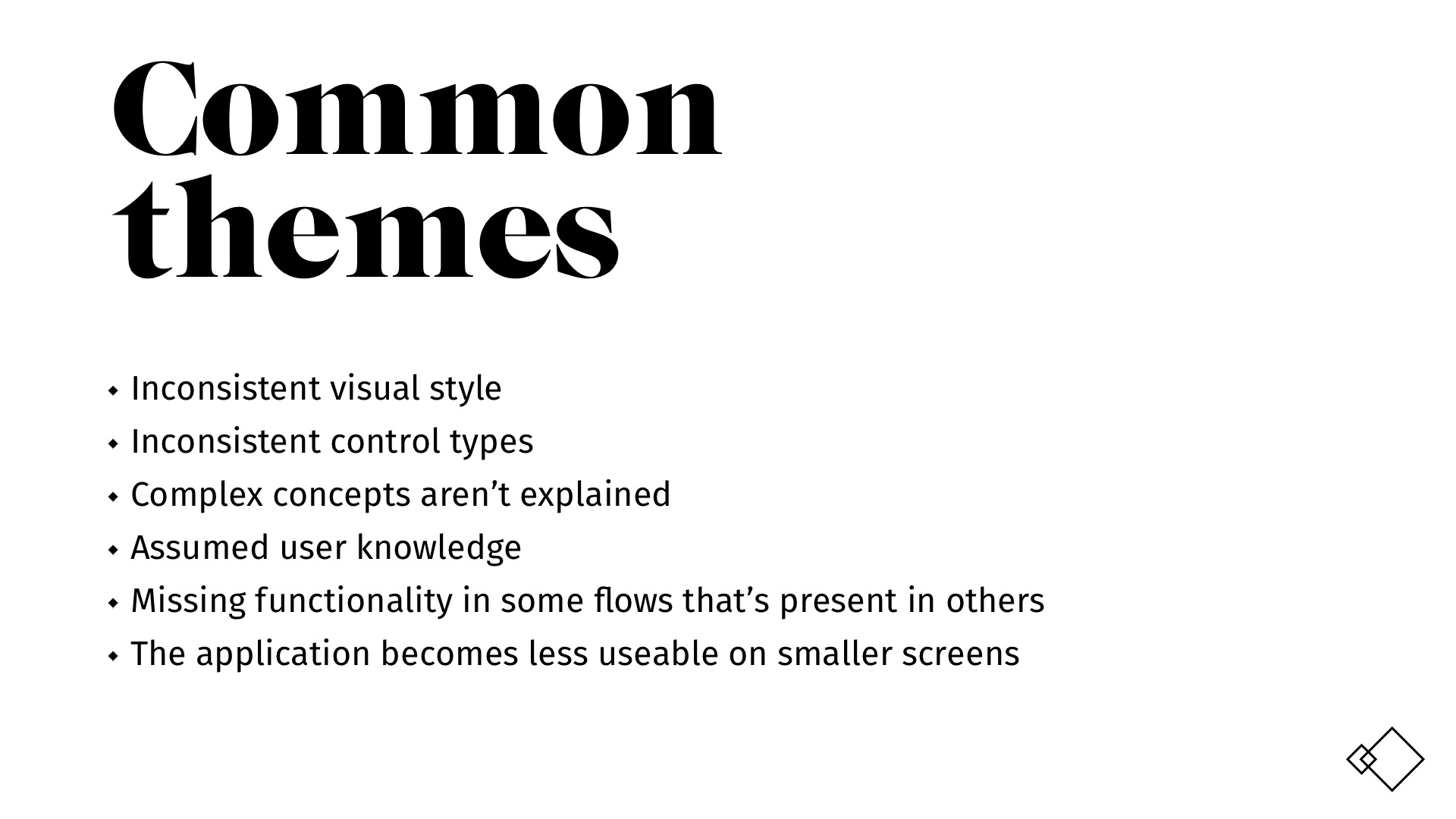
I ran an affinity mapping session from which some strong themes emerged. I was then able to put together a full application review — this detailed the issues which were having the most significant impact on users.
Using this visual laundry list, Onalytica’s teams were able to plan out fixes for specific UX problems. Moreover, presenting findings in this way further raised awareness of users and their needs.
Aligning teams, top-down
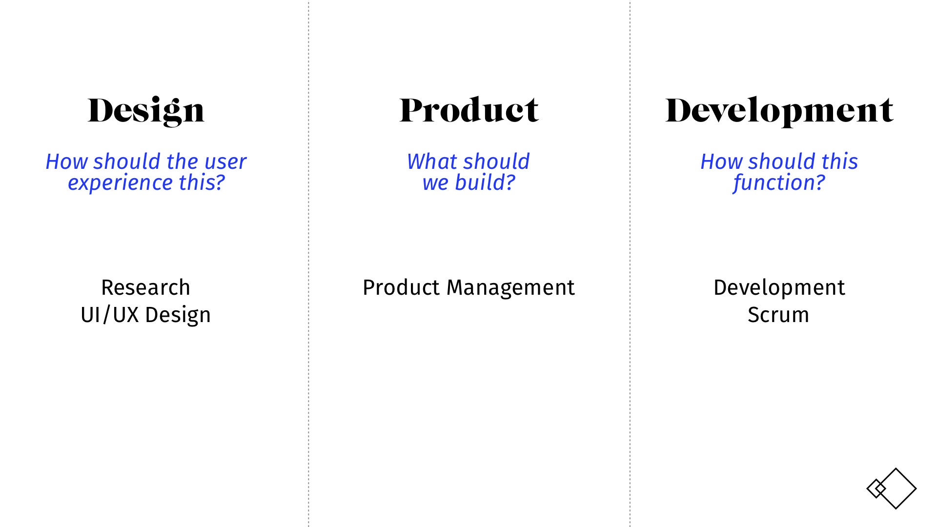
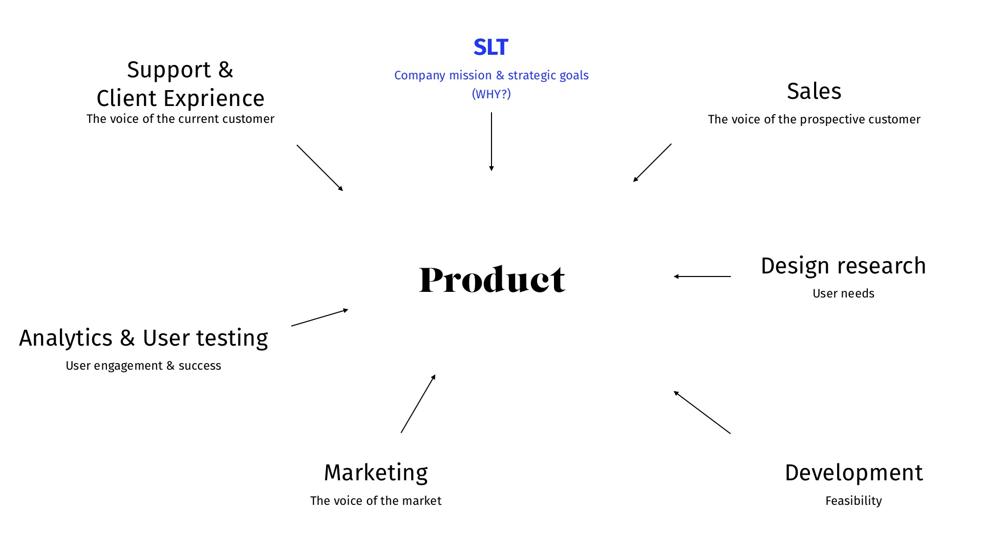
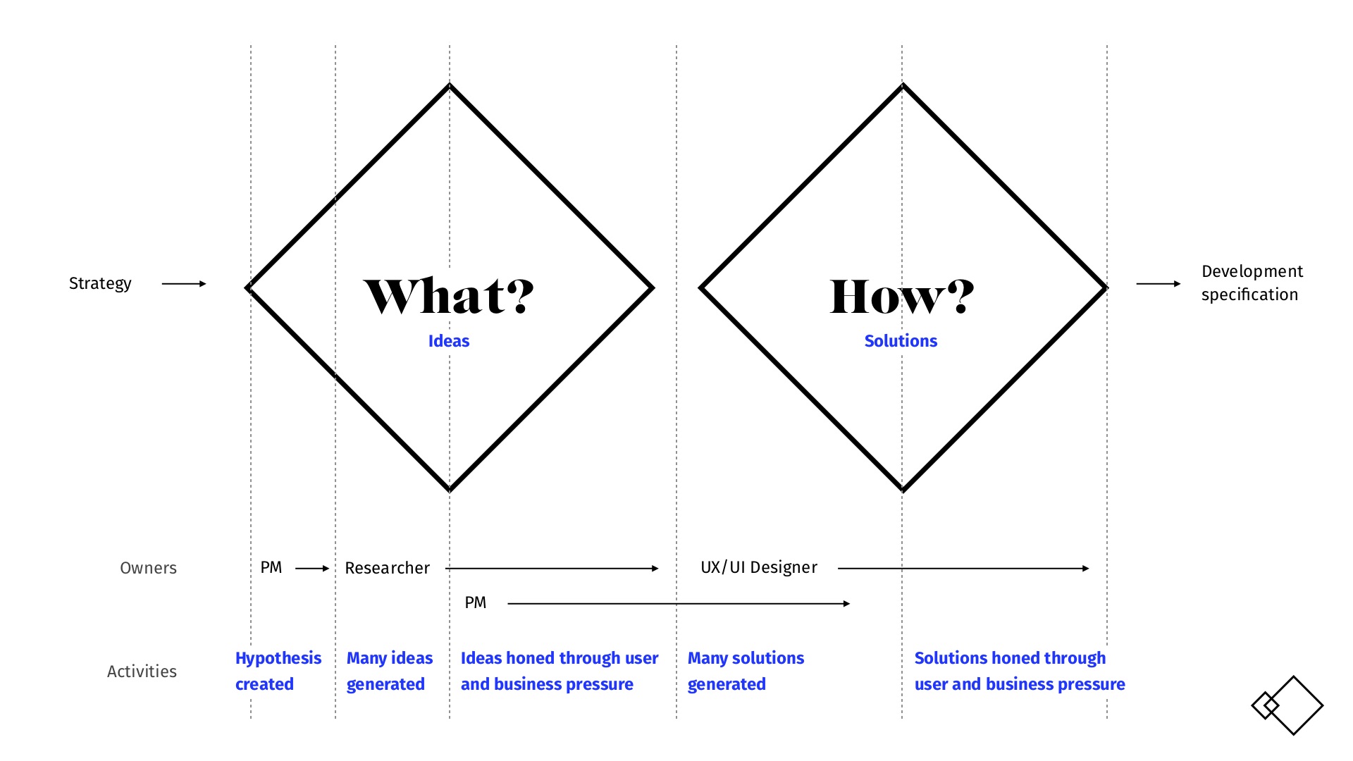
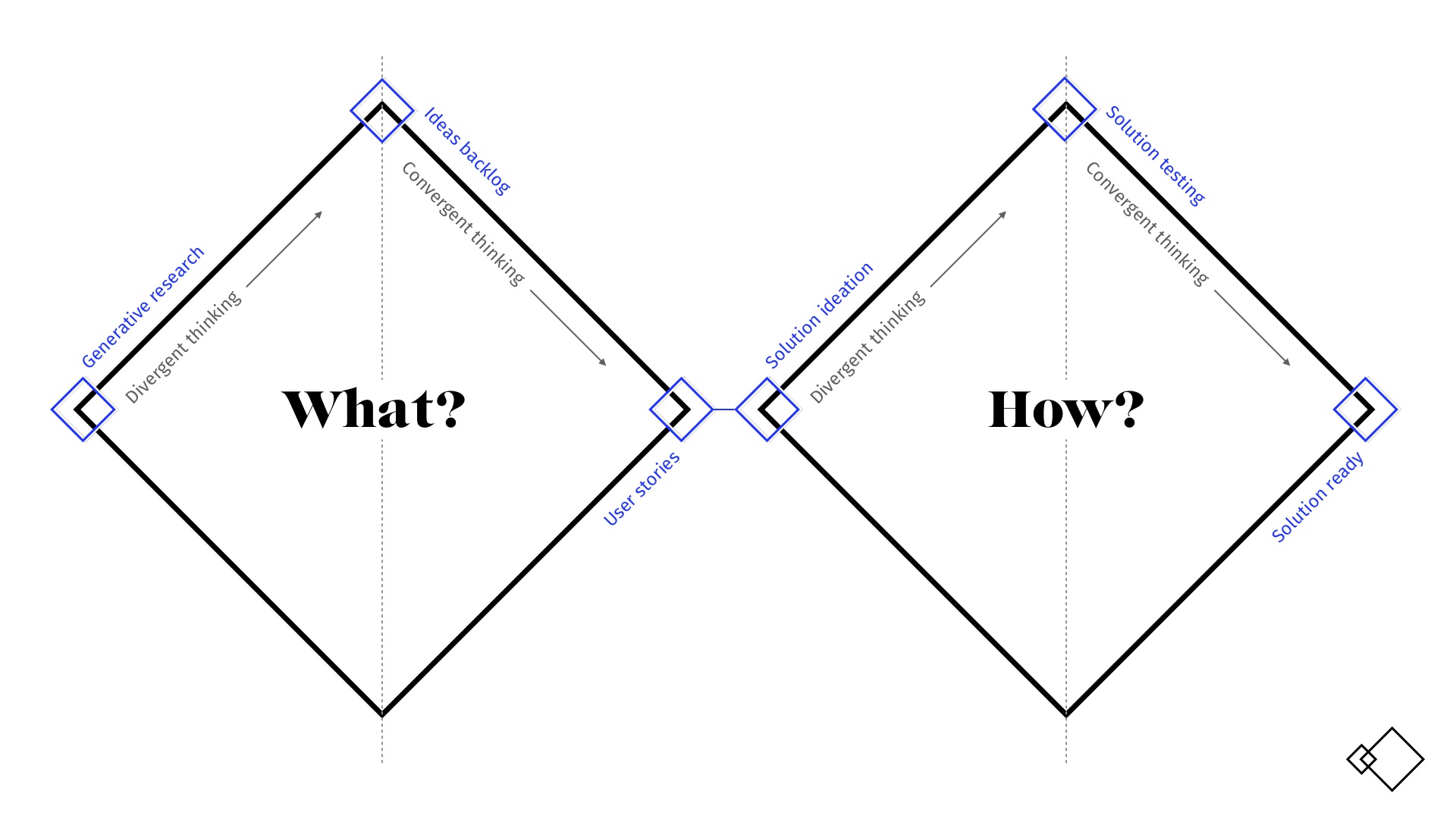
It was clear that many of the skills and processes they needed to improve the overall usability of their products were already in place. However, there wasn’t a single unified vision of how teams should work together from the top.
I gave a presentation to Onalytica’s management team in which I outlined a framework process and a set of clearly defined roles they needed to make this process work.
Jon has improved our processes, leading to better integration of design into the business. Through his time with us, Jon raised the visibility of design across the company, making it easier to engage with stakeholders.Karl Roche, Head of Product Design
A systematic approach to interface design
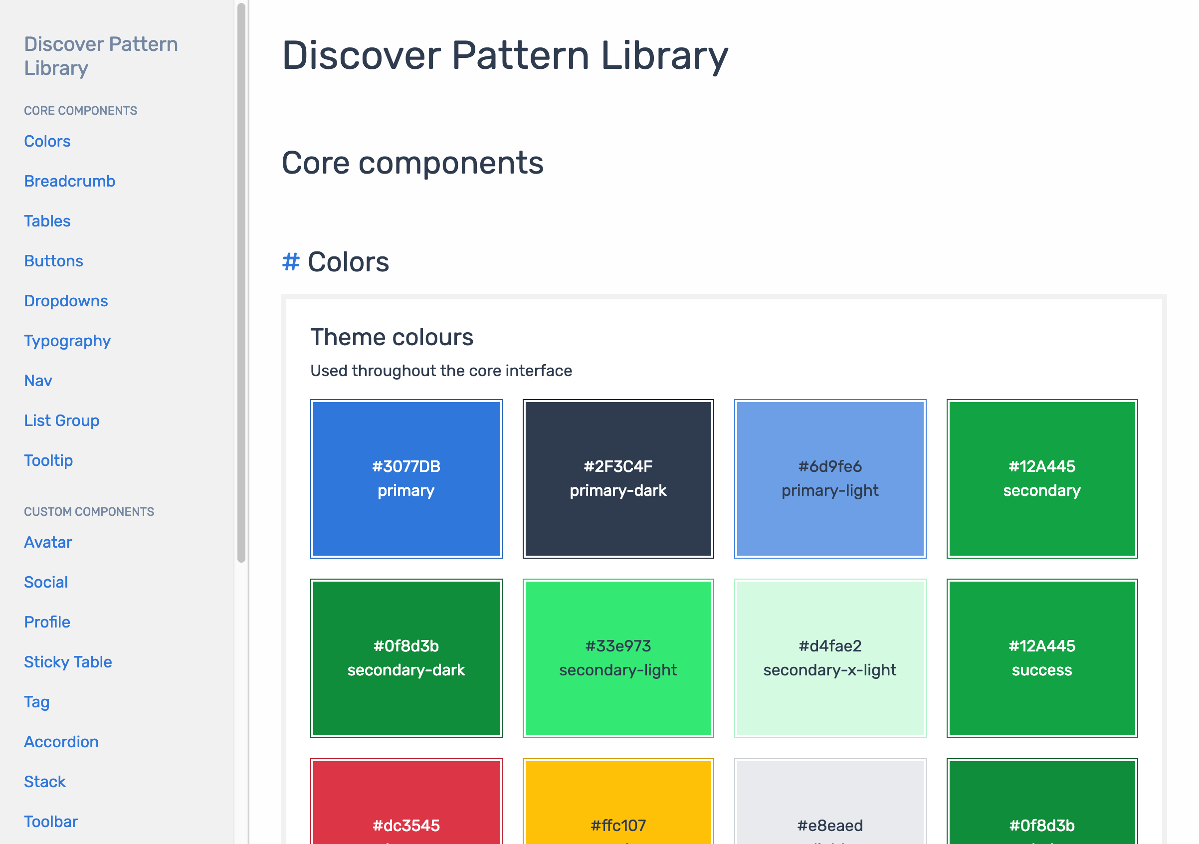
In the second phase of work I co-designed and built a pattern library.
Working alongside Onalytica’s design and development teams, I created a custom build of Bootstrap, on top of which I built a pattern library interface. This enabled both designers and developers to pick and use components easily.
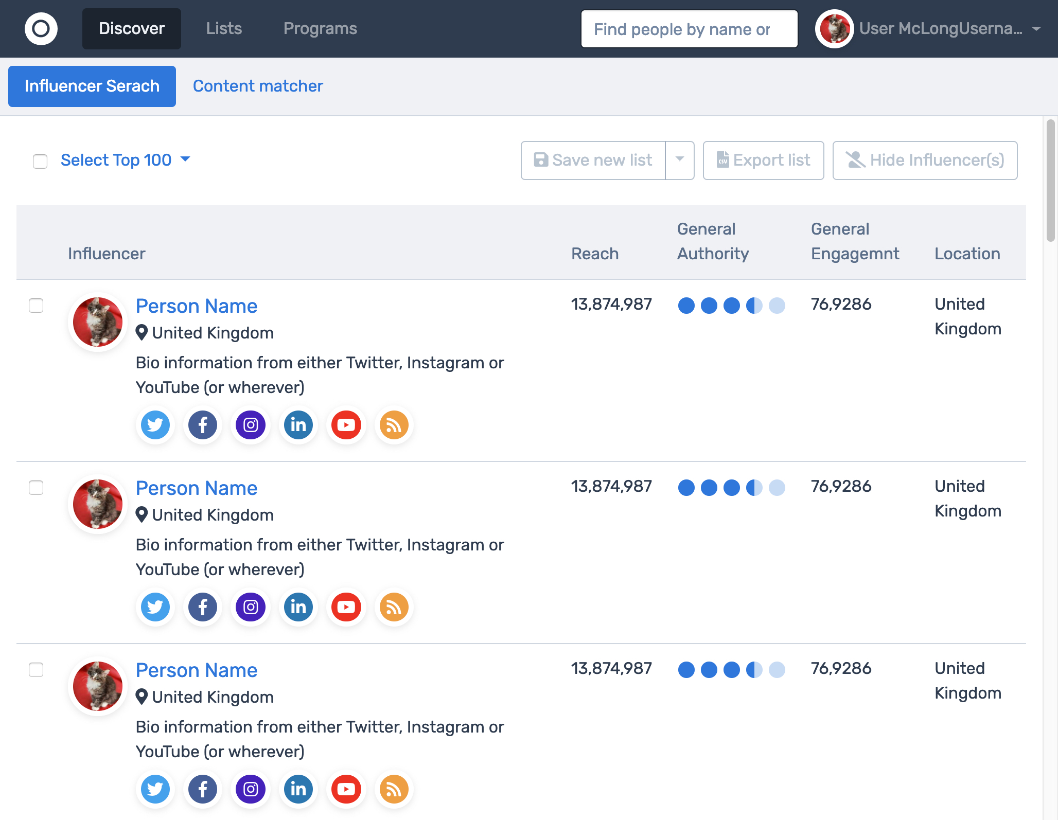
All the components compose together, so the pattern library can also be used for rapid prototyping and user testing.
Outcomes
A better process
Design, technology and product — and critically senior leaders — have a much clearer idea of how to run a user-centred design process.
Better team alignment
By involving people from across the business in the design process, Onalytica’s product team has increased understanding and buy-in from everyone.
A robust pattern library
Onalytica’s new pattern library serves as both the single source of truth for developers and as a test-bed for new interface ideas.
Jon is a great communicator and steered us through the UX options and decisions to plan work effectively. We’re delighted with the results - both technically and creatively.Andrew Macleod, CTO