Accessible corporation tax
I partially redesigned the corporation tax service so more people could use it.
The File your accounts and Company Tax Return service—aka CATO—has been around for a while. But, unfortunately, not everyone could use it. We worked with the Digital Accessibility Centre who wrote an end-to-end review of our service; it failed miserably.
Of course, we had to fix the technical accessibility issues found by DAC, but if we could also improve some other things along the way, why not!
We identified three areas for improvement:
- Flow: how might we help people navigate around and understand their place in the overall service?
- Code: how might we remove friction for assistive technology users?
- Complexity: how might we reduce confusion about what information we ask for on each screen?
Flow
Problem: A significant problem with the flow was due to the navigation. Each section within CATO used different navigation styles. Some users found this confusing, and we’d often see people completing tax returns over multiple sessions rather than just once.
Solution: The Task List pattern reduced cognitive load. A dedicated navigation page meant users weren’t distracted with too much on screen. In addition, we decreased the load further by splitting sections into small pieces.
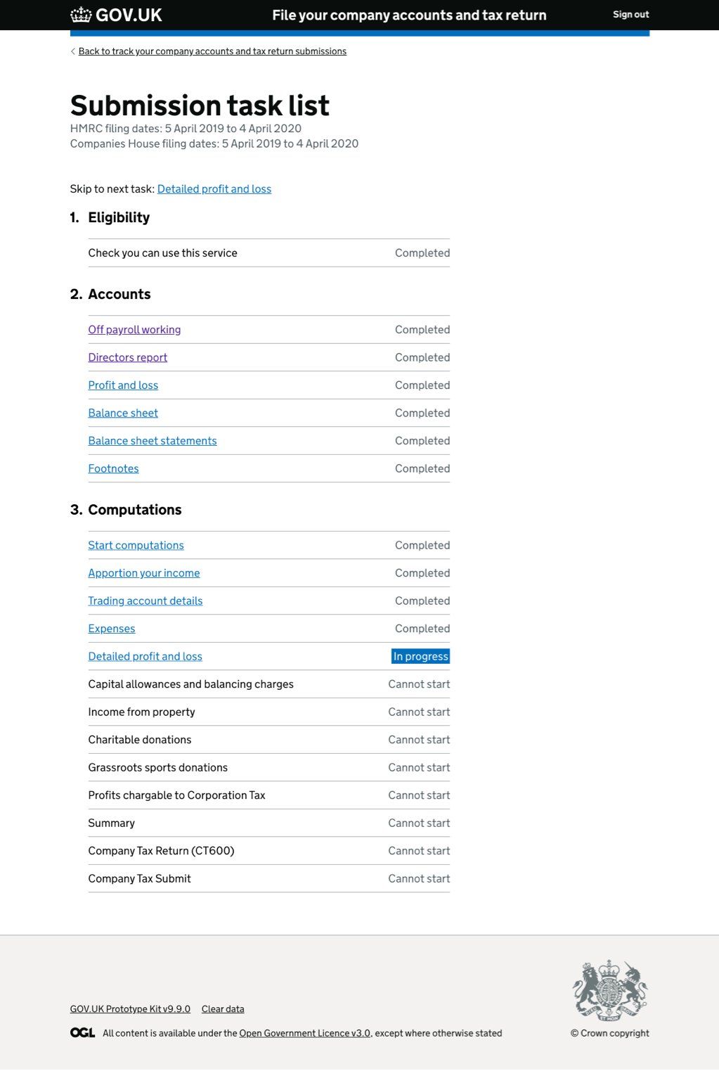
I experimented with some enhancements to the Task List. Building on the work of Martin Underhill, I used a minimal design approach. In testing, we found that users were perfectly able to use the interface without cumbersome labels.
Labels were beneficial on the “In progress” item; this was especially true when spotting the next action from a long list.
To help people using screen readers, I initially added a visually hidden “skip to next section” link. But, we found this to be great for keyboard users, too, so I made it visible.
Code
Problem: by far, the biggest problem for people using assistive technology (like screen readers, magnifiers, etc.) was the markup. In essence, if you couldn’t see the page, CATO was unusable.
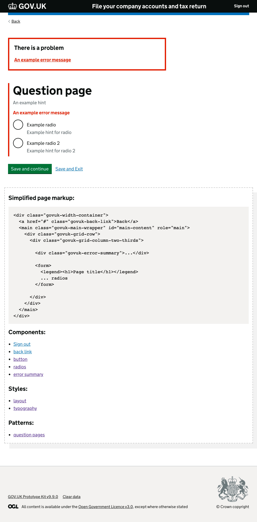
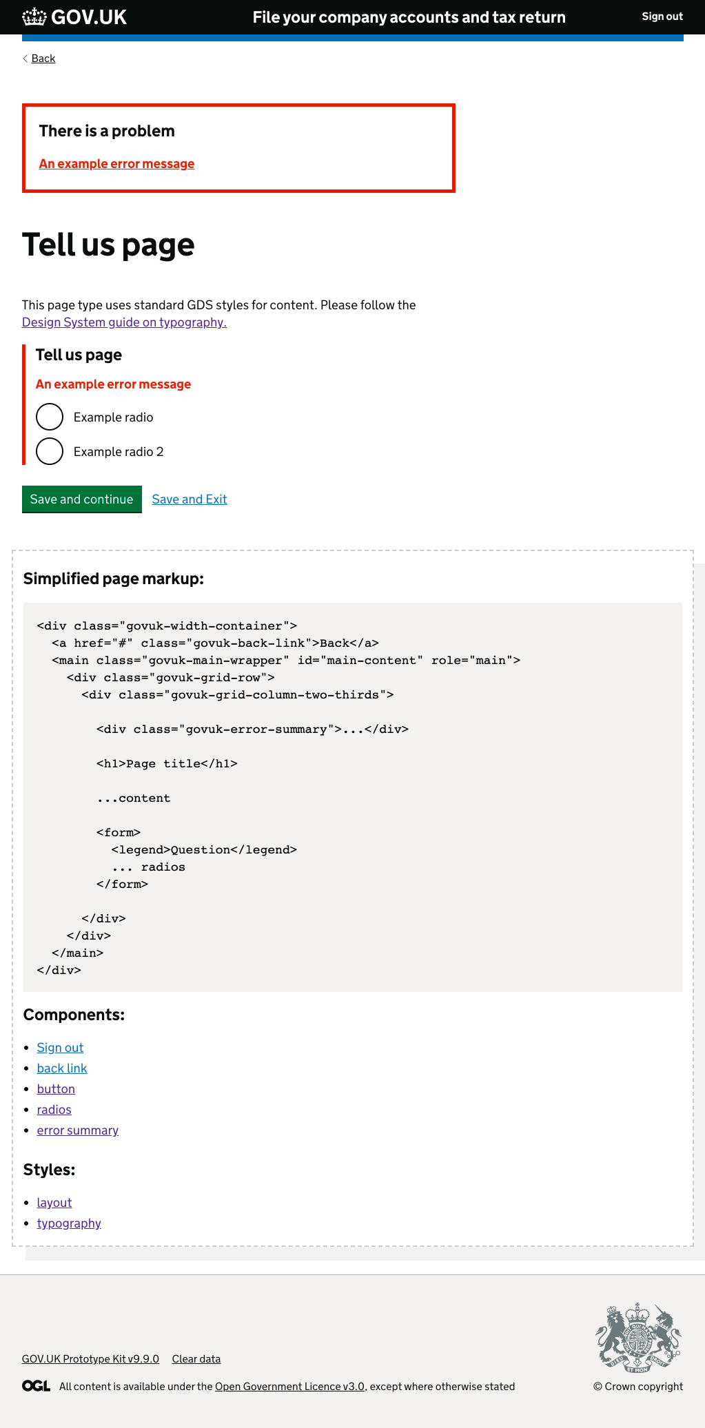
Solution: I created five templates, then used JAWS, VoiceOver and automated tools to test them to destruction. I simplified the whole eligibility flow and replaced each page with one of my new templates.
When testing the new pages with real people, we had to swap page order and content quickly. So I built a JSON schema that fed content directly into the templates. As a result, our content designer could edit content and restructure page flows quickly—without writing complex code.
I also created code specification pages for each template type to help developers make sure that markup was accessible.
Complexity
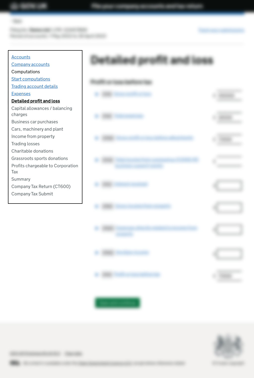
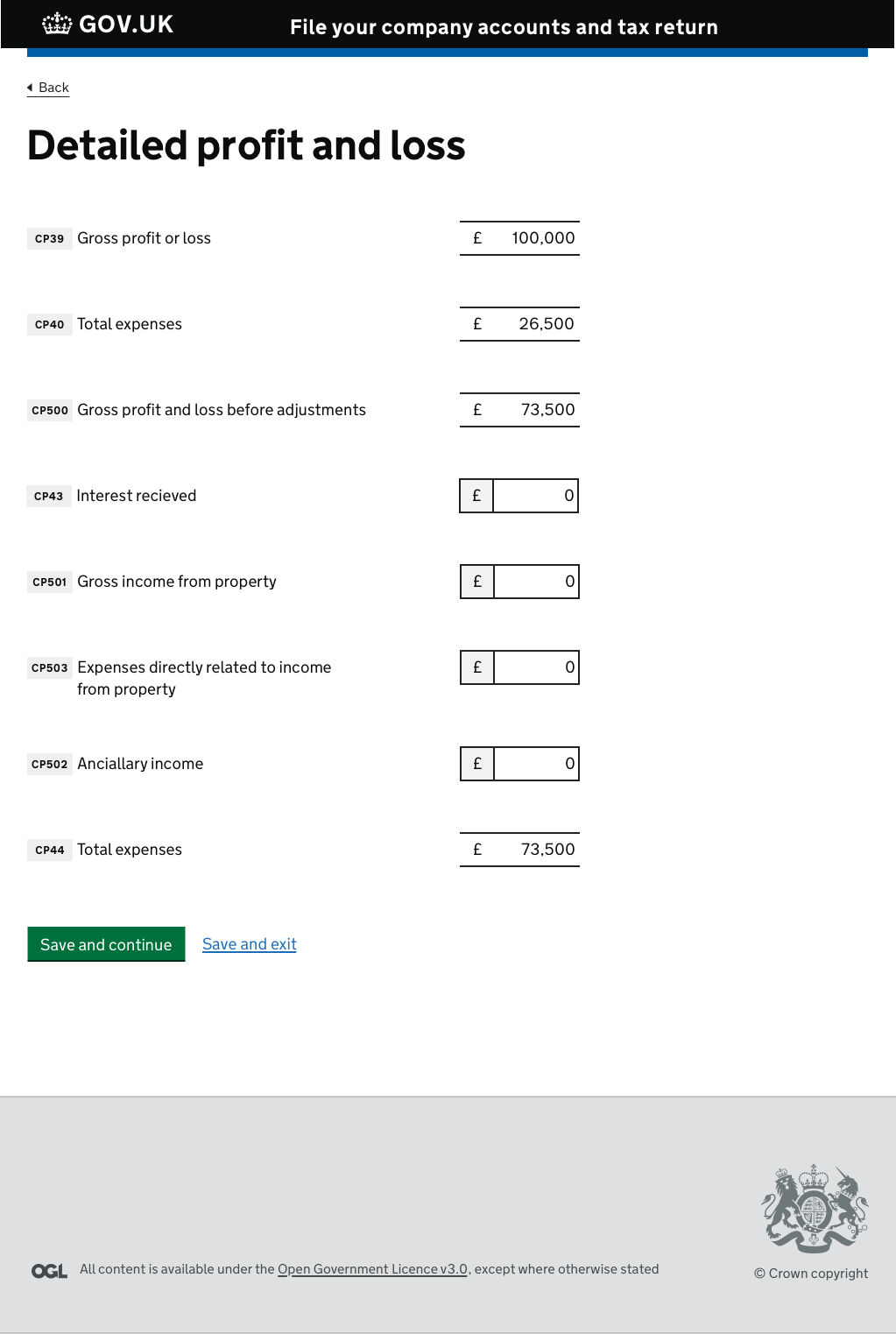
Problem: Each screen in CATO had a LOT going on. Pages contained navigation, status bar, user controls, footer and actual input fields. The perceived complexity was causing problems for all kinds of people.
Solution: By moving the navigation to the Task List and cleaning up the markup, I had already solved some of the issues.
The biggest challenge now was how to balance the speed of entering data with ease of use for all. GDS recommends one thing per page. But company accounts are their own thing, in a specific order. So it wouldn’t make any sense to separate questions onto single pages.
Most pages contain at least one calculation, so stacking input boxes vertically made sense. The wrinkle was the inline guidance for each line item.
My instinct was that I’d created a usable page, but we didn’t have an opportunity to test my design. I would have liked to work on the line item inputs more, but funding pressures meant the project came to an end.

Outcomes
Assistive technology loves CATO
People who use assistive technology (such as screen readers, magnifiers, text readers, etc.) now have a much easier time using the Corporation Tax service.
All boats rise with the tide.
It’s not just users with access needs that benefited from the work we did on CATO. Everyone now has an easier time using the service.