Design when it matters: Airline safety cards
The hidden design features that make airline safety cards surprisingly effective.
Recently I’ve been captivated by airline safety cards. You know, those laminated single-pagers that nestle alongside the magazines in aeroplane seat pockets? Specifically, I’m interested in why they look the way they do.
I heard the story on the brilliant 99% invisible podcast; it goes something like this:
In the early days, safety cards were little more than adverts for the airline. Enter two fellas called Dan Johnson and Beau Altman, who worked with Douglas Aircraft to understand crash survivability. Dan and Beau ran frightening-sounding escape simulations with participants of all ages (yes, even kids) to discover how to increase air crash survivability.
Existing research had shown that the majority of people survived the crash itself. However, it was getting out afterwards that proved the biggest killer. Ninety seconds was the golden number: If you couldn’t escape in ninety seconds, the cabin would become “unsurvivable”.
What astonished the duo was that reading the safety card made a huge difference. That was if someone could ingest the reams of dense text.
Their mission became apparent; they had to redesign the safety card to make it as effective as possible.
Do the hard work to make it simple
I love the story of the cards because Dan, Beau and artist Lary Bruns considered every little thing to make them as practical as possible.
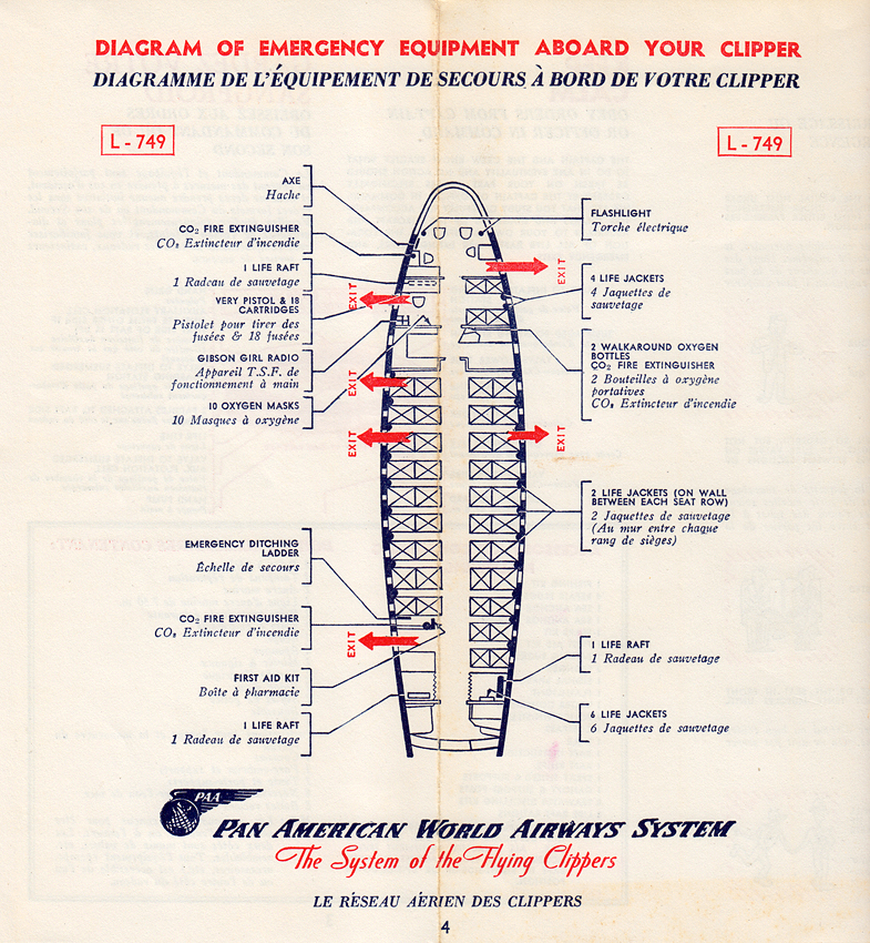
Back in the 60s, safety cards had improved somewhat. They were still mostly text, but there were at least some pictures. However, they showed generic cabin objects. So if you saw a picture of a door handle, it probably wouldn’t be the same as the one in your plane. They were printed in a bunch of languages and spiral-bound. Meaning you’d have to flick through to find the bit related to your aircraft in a language you could read. Not ideal for quickly digesting information.
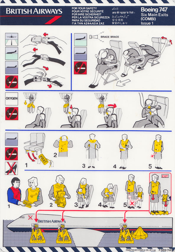
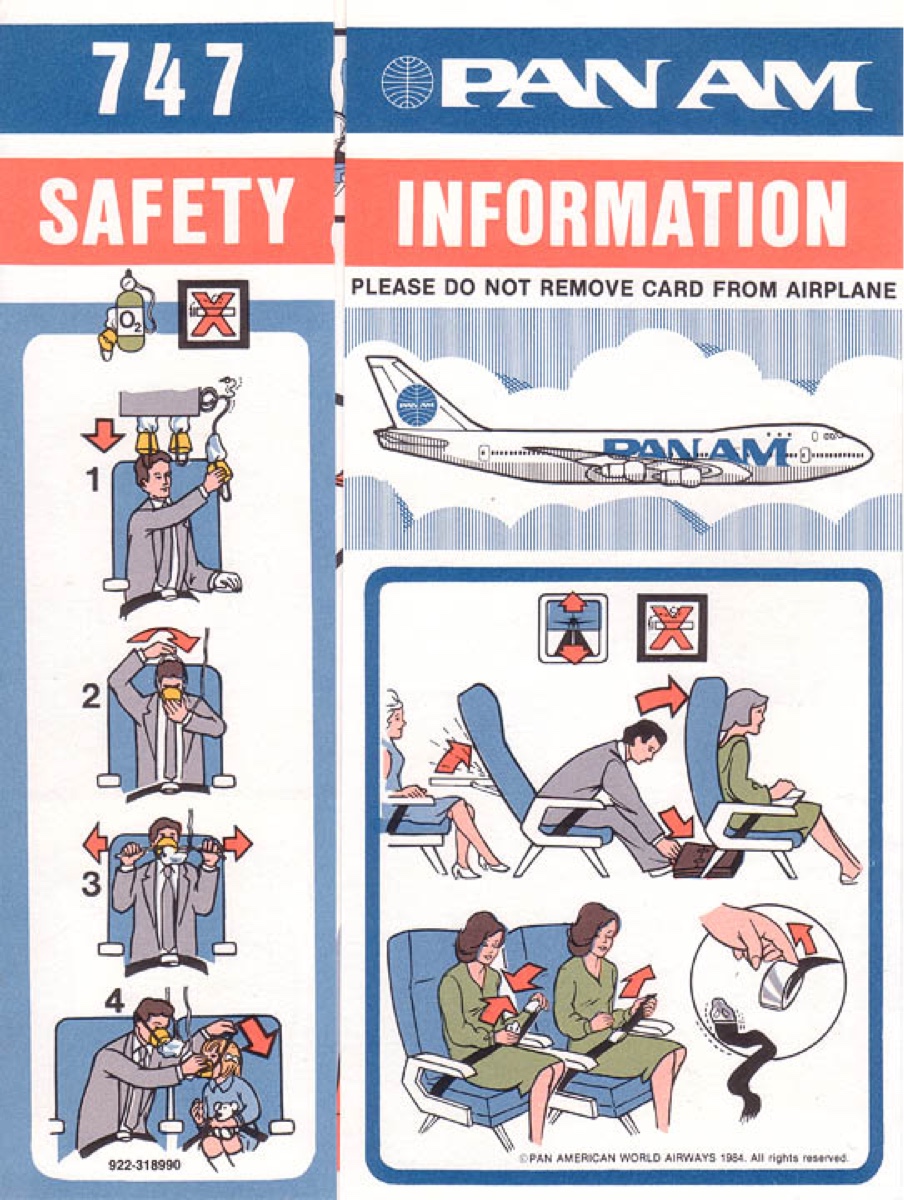
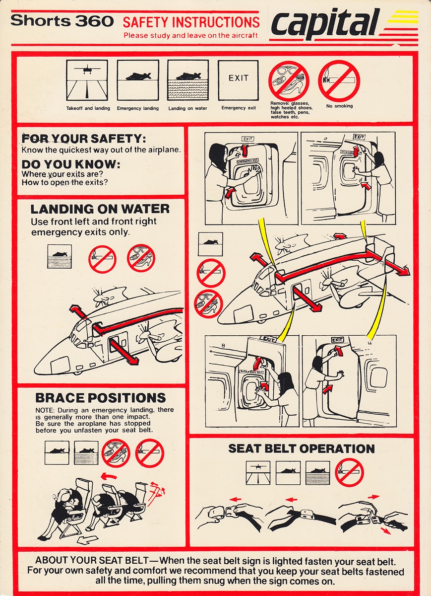
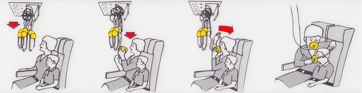
Dan, Beau, and Lary did away with the dense text and relied on pictures. The only word they allowed was “exit”.
They made the cards specific to each aircraft. So if the door handles were red and opened counter-clockwise, they’d show this on the card.
Lary designed the trademark expressionless models to help reduce Tonic immobility; this happens in high-stress situations and immobilises its sufferers. The characters are calm because this is the best way to communicate vital information without causing further stress.
What’s more, they tested and refined many times by asking people, “do you understand what’s happening here?”
Safety cards are a design masterpiece. Not because of the way they look (although I do love their aesthetic) but because of the thinking that’s gone into making them so effective.
Before the 99% Invisible episode, I’d never heard of Dan Johnson, Beau Altman and Lary Bruns. Now, they’re among my design heroes.
Further reading
The story of safety cards is from an episode of the excellent 99% Invisible podcast called “In The Unlikely Event”. I’d highly recommend you give it a listen.
All the images in this article come from Kevin Cleynhens’ website. A long time collector, Kevin has a mind-blowing array of safety cards.
You can contact me to respond to this article.