Accessible timelines
Designing a component to display things in time order in a way that make sense to all users.
Last year, I designed a service that allows users to follow the status of their VAT repayments.
When a company submits a VAT return, HMRC’s computer system automatically tracks its progress. Status codes are used to indicate the state of each claim. Basically, our service translated the status codes into English and presented them to the user.
This article is about the design and development of a timeline component.
Design goals
In designing and building a timeline, my goals were:
- users should immediately understand that events are part of an overall sequence;
- users should find it easy to understand which order events are in;
- the timeline should fit in with the overall aesthetic of GOV.UK;
- the timeline should be accessible by anyone.
Existing solutions
I’d be crazy to start with a blank page. Especially when working on a government project. There’s a rich seam of existing designs that others have tried before. And, of course, there’s a core set of styles, components and patterns that should always be the first port of call.
Text-based
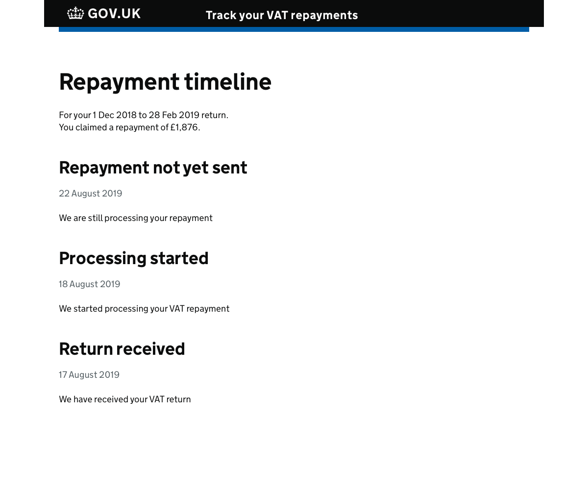
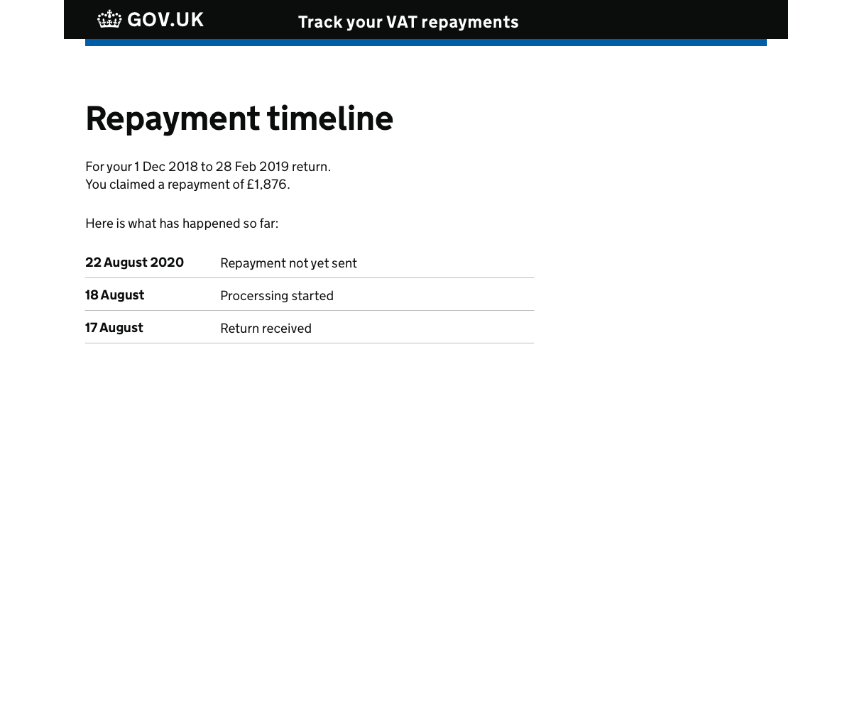
I tried listing the statuses on a page with simple text elements. However, we found users were confused by the relationships between items. Although slightly better, the Summary List component proved confusing too.
Track progress
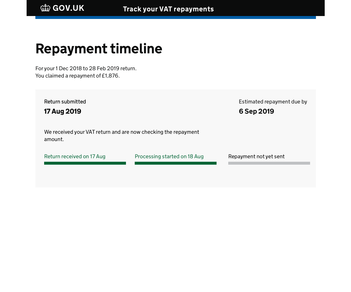
I tried the track progress component that is in use on some HMRC services. Could this be adapted to our needs?
This component works well on services with a fixed number of events, but it’s not so great for variable events. I couldn’t easily show the entire history of repayments without resorting to awkward scroll bars.
Progress bar
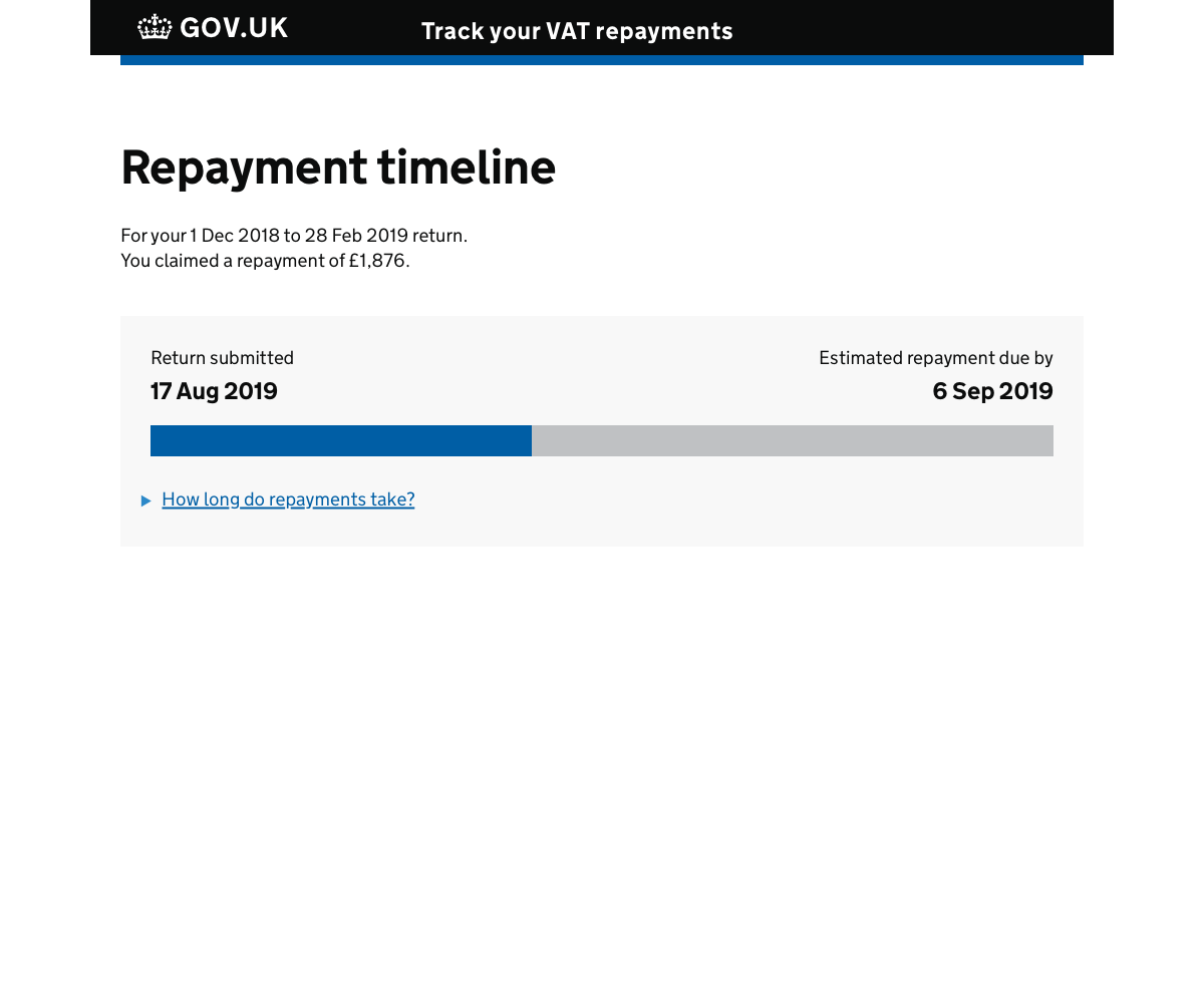
At one stage, it looked like obtaining the events from HMRC’s system wasn’t going to be possible. Therefore, we could only give users a rough idea of progress. We’d do this based on the average time for a repayment; a progress bar seemed perfect for this.
Thankfully, it turned out that we could show each status. So I didn’t spend too much time on this design. But in testing, we found that:
- users were initially confused by the progress bar; they were waiting for the page to load more content;
- users didn’t understand how much progress they’d made through the process;
- showing dates was beneficial as it reduced uncertainty and anxiety
Timeline
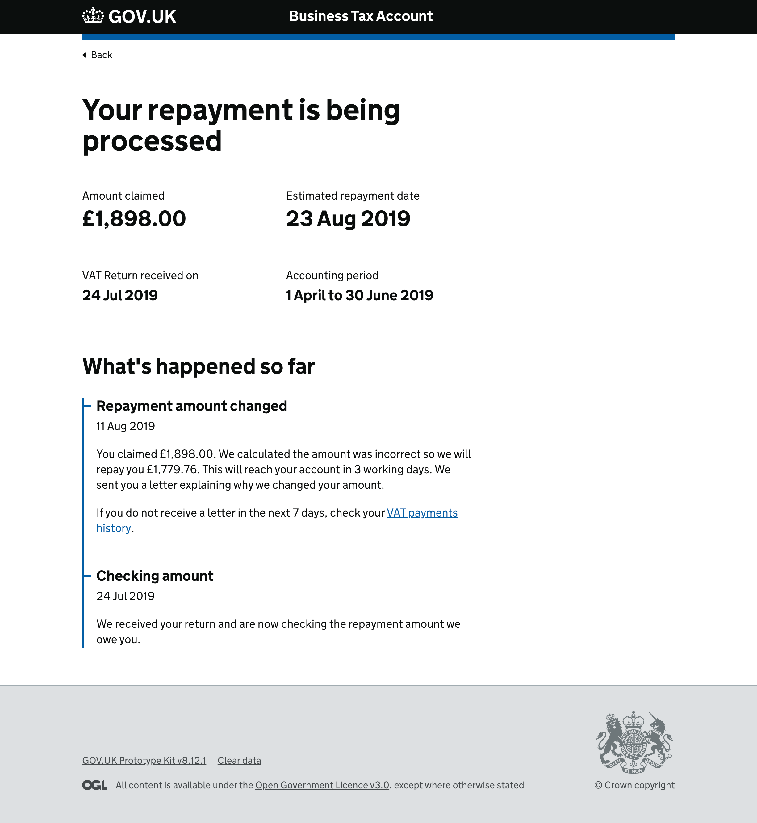
As we were showing events in time, the timeline pattern seemed like the obvious solution. The DWP had done some great work on their timeline component and had kindly published the findings from user testing. I based my design on theirs.
We tested the timeline as part of the testing on the VRT in multiple rounds. It tested well and met the first three of my design goals. We found some accessibility issues, but I’ll talk more about that in the code section, below.
Code
I’ve been fulfilling a hybrid role at HMRC, part designer part front-end developer. I based the markup and styles for the final live timeline on the DWP timeline pattern.
I tweaked the info element to allow the use of <time datetime=“…”> so that microformats readers could follow the events. I also replaced paragraph elements with span or div so I could better control the styling.
Here’s the markup for the first version I wrote:
<ol class="timeline">
  <li class="timeline-event">
    <h2 class="timeline-event-title govuk-heading-m">Checking amount</h2>
    <p class="hmrc-timeline-event-meta">
      <time class="hmrc-timeline-event-time" datetime="2019-07-14">24 July 2019</time>
    </p>
    <p>We received your return and are now checking the repayment amount we owe you.</p>
  </li>
</ol>
When testing our timeline component for accessibility issues, we discovered that:
- some users struggled to read dates in the govuk-hint style;
- VoiceOver on a mac would read out dates multiple times.
As the requirement to make the timeline accessible to microformats-type readers was an edge case, I decided to remove that functionality.
In our case, rendering dates in the standard text colour worked well. But displaying more than just a date here might get confusing; if you needed to show a date and a reference number, for example.
Here’s the final mark-up:
<ol class="timeline">
  <li class="timeline-event">
    <h2 class="timeline-event-title">Checking amount</h2>
    <span class="timeline-event-meta">24 July 2019</span>
    <div class="timeline-event-content">
      <p>We received your return and are now checking the repayment amount we owe you.</p>
    </div>
  </li>
</ol>
I created a Nunjucks macro to make it simple to reuse across different projects.
Wrapping up
We found the modified DWP component an excellent solution when displaying events. Users understood their time-based nature and which order they appeared in. I made some modifications to the HTML and CSS to fix some accessibility issues.
I also submitted this as a candidate pattern, which was later accepted into the HMRC design system.
You can contact me to respond to this article.